The History
of Visual
Communication
Postmodernism
Postmodernity is a term used to describe the social and cultural implications of postmodernism. The term is used by philosophers, social scientists, art critics and social critics to refer to aspects of contemporary art, culture, economics and social conditions that are the result of the unique features of late 20th century and early 21st century life. These features include globalization, consumerism, the fragmentation of authority, and the commoditization of knowledge (see "Modernity"). "Post-modernity" is also used to demark a period in art, design and architecture beginning in the 1950's in response to the International Style, or an artistic period characterized by the abandonment of strong divisions of genre, "high" and "low" art, and the emergence of the global village. Postmodernity is said to be marked by the re-emergence of surface ornament, reference to surrounding buildings in urban architecture, historical reference in decorative forms, non-orthogonal angles such as the Sydney Opera House and the buildings of Frank Gehry.
The Computer


Deconstruction


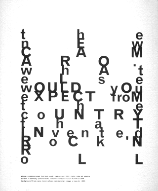
Deconstructivist typography by "Substance" design agency: Billboard ads by Cornell Windlin. London, UK, mid 1990's
Deconstruction is a term which is used to denote the application of post-modern theory, to a "text". A deconstruction is meant to undermine the frame of reference and assumptions that underpin the text. Jacques Derrida, who coined the term, argued that the existence of deconstruction implied that there was no intrinsic essence to a text, merely the contrast of difference. This is analogous to the scientific idea that only the variations are real, that there is no established norm to a genetic population, or the idea that the difference in perception between black and white is the context. A deconstruction is created when the "deeper" substance of text opposes the text's more "superficial" form. According to Derrida, one consequence of deconstruction is that the text may be defined so broadly as to encompass not just written words, but the entire spectrum of symbols and phenomena within Western thought. To Derrida, a result of deconstruction is that no Western philosopher has been able to escape successfully from this large web of text and reach that which is "signified", which they imagined to exist "just beyond" the text.
The more common use of the term is the more general process of pointing to contradictions between the intent and surface of a work, and the assumptions about it. A work then "deconstructs" assumptions when it places them in context.
In graphic design deconstructivism gave its name to one of the major typographic movements, starting in the early 1980's and continuing into the late 1990's: Deconstructive Typography. Taking on a more experimental approach to typography, the Dadaists and Futurists in the 1920s and 1930s, and later the Concrete Poets during 1950s and 1960s experimented with floating type compositions and fragmented typographic treatments, releasing type from its linear structure. Further developments of the deconstructivist typography in the 1990’s shifted the typographic practice towards a spatial, non-linear process: ‘Communication for the deconstructivist is no longer linear, but involves in-stead the provision of many entry and exit points for the increasingly over-stimulated reader.’ [Cahalan 1994, p.1] The page is no longer to be just "read" but also "perceived", beyond the pure textual content, into all of its associative conjunctions: We are meant to "feel" rather than "read" a page.
The Vernacular


Garment labels, embroidery samplers, cafe menus, ticket stubs - vernacular as "perceptual" object for typography.
The end of the century, with the rising issues surrounding global economies, ecology and rising poverty in developing countries was a time when graphic designers took a long, hard look at the nature of their work; at its ephemereal qualities, its associations with consumerism/capitalism. The outcome took into account unexpected resources; the ordinary, the often-used, the soon to be discarded - as indeed is most of the output of graphic design itself. Designers sought inspiration in unlikely items such as old ticket stubs, torn billboards and discarded packages and the expression and legitimization of the vernacular.
Punk
In England during the mid 1970s a Punk rock band named the Sex Pistols became a major design influence, the power of which has extended itself unto today, particularly in fashion design, but in Graphic Design also. Indeed it can be said that most of the design movements after the 1960s have continued to hold their influence up until the present, have never really gone out of style like so many of their precursors did.


Punk was also one of the inspirations, along with 'postmodern' fiction for the science fiction genre known as 'cyberpunk'. The technological potential unleashed by desktop publishing and graphics software allied with the methodological potential offered by variously by punk and French deconstructionist philosophy produced a style of graphic design and typography known sometimes as deconstructionist graphic design, and sometimes as 'The New Typography'. Though obviously coming out of different contexts and circumstances, these developments shared a fascination with contemporary technology and in both its utopian and dystopian possibilities, as well as its glamour. They also evince similar tropes and strategies, of appropriation, juxtaposition, detournement, montage, collage, repetition, facilitated by or reflecting upon the extraordinary capabilities of that technology. The deconstructionist graphic design's use of layers and experimentation with typography all reflected a world of diffused and distributed communication mediated through networks of powerful information technologies.
The End of the Millenium
The reaction to the increasing severity imposed by modernism and minimalistic movements such as the Swiss Style on graphic design was slow but inexorable, resulting in new typographic investigations and trends, as we have already seen in the examples and movements above. Compounding this frustration however, was also the disillusionment that designers and art director's increasingly felt towards the requirements and bland approach of the advertising sector by which they were largely employed, and the history of this frustration actually goes back further than the end of the millennium, has its origins in the 1960s.
The reaction to the increasing severity imposed by modernism and minimalistic movements such as the Swiss Style on graphic design was slow but inexorable, resulting in new typographic investigations and trends, as we have already seen in the examples and movements above. Compounding this frustration however, was also the disillusionment that designers and art director's increasingly felt towards the requirements and bland approach of the advertising sector by which they were largely employed, and the history of this frustration actually goes back further than the end of the millennium, has its origins in the 1960s.

First Things First Manifesto of 1964.
An important point was reached in graphic design with the publishing of the First things first 1964 Manifesto which was a call to a more radical form of graphic design and criticized the ideas of value-free design. This was massively influential on a generation of new graphic designers and contributed to the founding of publications such as Emigre magazine.
The First Things First manifesto was written 29 November 1963 and published in 1964 by Ken Garland. Today we may not understand the significance of the document which at the time caused consternation. It was backed by over 400 graphic designers and artists and also received the backing of Tony Benn, radical left-wing MP and activist, who published it in its entirety in the Guardian newspaper. Reacting against a rich and affluent Britain of the sixties, it tried to re-radicalise design which had become lazy and uncritical. Drawing on ideas shared by Critical Theory, the Frankfurt School and the counter-culture of the time it explicitly re-affirmed the belief that Design is not a neutral value-free process. It rallied against the consumerist culture that was purely concerned with buying and selling things and tried to highlight a Humanist dimension to graphic design theory. It was later updated and republished with a new group of signatories as the First Things First 2000 manifesto.

First Things First 2000.
The First things First 2000 manifesto was an updated version of the earlier First things first 1964 Manifesto. it was published in 2000 by some of the leading lights of the graphic design, artistic and visual arts community. It was republished by Emigre, Eye and other important graphic design magazines and stirred some controversy within the profession.

Culture jamming is the act of transforming existing mass media to produce negative commentary about itself, using the original medium's communication method. It is a form of public activism which is generally in opposition to commercialism, and the vectors of corporate image. The aim of culture jamming is to create a contrast between corporate image and the realities of the corporation. This is done symbolically, with the "detournement" of pop iconography.
In essence, the question of value-free design has been continually contested in the graphic design community between those who are concerned about the values in design and those who believe that design can be value-free. Those who believe that design can be free from values feel that the graphics industries themselves should not be concerned with the underlying political questions. Those who are concerned with values believe that graphics and the designers themselves must be critical and take a stand, for instance by not promoting industries and products perceived to be 'bad'. Examples of what might be classified as bad are adverts and designs for cigarette manufacturers, arms companies and so on. This has been particularly influential on AdBusters, for example, and is related to ideas of detournement (In detournement, an artist reuses elements of well-known media to create a new work with a different message, often one opposed to the original) and culture jamming.
Important Actors
While the field of Graphic Design has been very prolific, and has brought forth many noteworthy designers over the past decades, nevertheless there are some important trend-setting figureheads who have spearheaded some of the major influences of this era. Thus, some extra attention is devoted to 3 of these innovators - Neville Brody, Emigre and David Carson.
Neville Brody


Neville Brody for FUSE magazine. 1980s, London, UK.
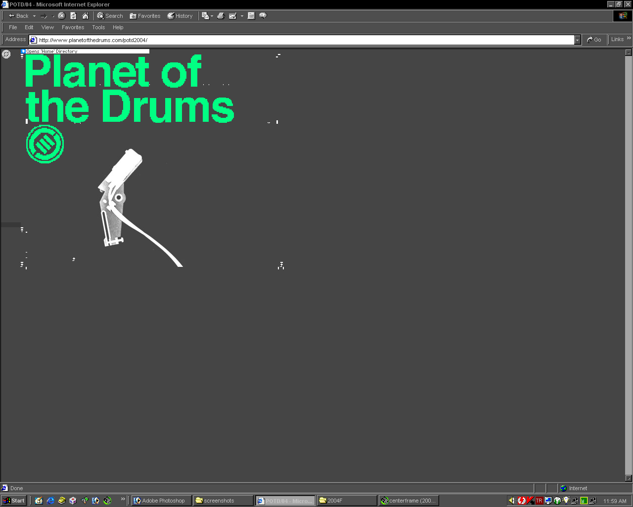
Neville Brody (1957 - ) is an alumnus of the London College of Communication and is known for his work on The Face magazine (1981–1986) and Arena magazine (1987–1990), as well as for designing record covers for artists such as Cabaret Voltaire and Nine Inch Nails. He was one of the founding members of FontFont (now FontShop) in London and designed a number of notable typefaces for them. He was also partly responsible for instigating the FUSE project an influential fusion between a magazine, graphics design and typeface design. Each pack includes a publication with articles relating to typography and surrounding subjects, four brand new fonts that are unique and revolutionary in some shape or form and four posters designed by the type designer usually using little more than their included font.


Initially working in record cover design, Brody made his name largely through his revolutionary work as Art Director for the Face magazine. Other international magazine directions have included City Limits, Lei, Per Lui, Actuel and Arena, together with London's The Observer newspaper and magazine. Brody has consistently pushed the boundaries of visual communication in all media through his experimental and challenging work, and continues to extend the visual languages we use through his exploratory creative expression.
In 1994, together with business partner Ewa Richards, Brody launched Research Studios, London. A sister company, Research Publishing, produces and publishes experimental multi-media works by young artists. The primary focus is on FUSE, the renowned conference and quarterly forum for experimental typography and communications that brings together speakers from design, architecture, sound, film and interactive design and web.
Emigre


Emigre magazine spreads and covers displaying the Emigre fonts.
Emigre also known as Emigre Graphics, is a type foundry in Berkeley, California, founded by Rudy VanderLans and Zuzana Licko. It also published Emigre magazine between 1984 and 2005. Note that unlike the word émigré, Emigre is officially spelled without accents. Emigre was founded in 1984 as an independent foundry, developing typefaces without an association with a typesetting equipment manufacturer.
Through a good part of the late 1980s and most of the 1990s, some of the most cutting-edge typefaces were developed or released by Emigre. Its magazine, in the meantime, provided an outlet showcasing the potential of its typeface designs, and was well known for its graphical experimentation. Emigre has also published a number of books related to graphic design.
David Carson
David Carson (1956 - ) is best known for his innovative magazine design, and use of experimental typography. His first actual contact with graphic design was made in 1980 at the University of Arizona on a two week graphics course. Later on in 1983, Carson was working towards a Bachelor of Arts in Sociology when he went to Switzerland, where he attended a three-week workshop in graphic design as part of his degree. This is where he met his first great influence, who also happened to be the teacher of this course, Hans-Rudolph Lutz.
David Carson, miscellaneous editorial and advertising design works from the 1990s and early 2000s.


During the period of 1982–1987, Carson worked as a teacher in Torrey Pines High School in San Diego, California. In 1983, Carson started to experiment with graphic design and found himself immersed in the artistic and bohemian culture of Southern California. By the late eighties he had developed his signature style, using "dirty" type and non-mainstream photography. He would later be dubbed the "father of grunge."
David Carson, Beach Culture magazine. 1989- 1991.


In his work the computer, both in terms of image processing as well as typography interferences, that could be done via software such as Adobe Photoshop and the Macromedia packages was crucial. Carson went further than any of his generation in exploiting these to create his unique "grungy" style. Computer technologies enabled him to break every known graphic design rule, including negative leading, overlapping, layering, and creating absurd compositional layouts, such as backwards text settings and columns of texts that bled off the page or aligned or overlapped each other. And yet during all of his adventures we can see that Carson still abides by the principles of design such as establishing focal point, eye flow, hierarchy and negative space.
David Carson, Raygun. 1992 - 1995. Ray Gun was an alternative music magazine, so instead of designing by a grid or with any specific structure, Carson created spreads based on how the music spoke to him. He explored reverse leading, extreme forced justification, text columns jammed together, and minimal contrast between the text and the background color. Parts of letters were sliced away asking the reader to decipher the message. Page numbers might be set in large display type, article titles were letter spaced erratically across images or arranged in expressive rather than normative sequences.


Among other things, he was also a professional surfer and in 1989 Carson was qualified as the 9th best surfer in the world. His career as a surfer helped him to direct a surfing magazine, called Beach Culture. This magazine lasted for three years but, through the pages of Beach Culture, Carson made his first significant impact on the world of graphic design and typography with ideas that were called innovative even by those that were not fond of his work. From 1991-1992, Carson worked for Surfer magazine. A stint at How magazine (a trade magazine aimed at designers) followed, and soon Carson launched Ray Gun, a magazine of international standards which had music and lifestyle as its subject. In 1995, Carson founded his own studio, David Carson Design in New York City.
In November 1995, Carson published his first book the End of Print. His second book, 2nd Sight, followed in 1997. It is said that this book simply changed the public face of graphic design (Newsweek). In 1998, Carson worked with Professor John Kao of the Harvard Business School on a documentary entitled "The Art and Discipline of Creativity." The third book that Carson published was Fotografiks (1999) which earned Carson the Award of Best Use of Photography in Graphic Design. Carson’s fourth book, Trek, was released in 2000. Carson has also helped in the development of The History of Graphic Design by Philip Meggs.
The Computer
In 1950 the British mathematician and computer pioneer Alan Turing published a paper describing what would come to be called the Turing Test. The paper explored the nature and potential development of human and computer intelligence and communication, while the first commercially successful electronic computer, UNIVAC, was also the first general purpose computer - designed to handle both numeric and textual information was also designed the same year. The implementation of this machine marked the real beginning of the computer era.
In the mid 1980s, just 30 years later, the arrival of desktop publishing and the introduction of software applications introduced a generation of designers to computer image manipulation and 3D image creation that had previously been unachievable. Computer graphic design enabled designers to instantly see the effects of layout or typography changes without using any ink in the process. not only did computers greatly speed up and facilitate the traditional design process, they also gave a completely new outlook to sketching and idea formation, enabling designers to virtually create endless generations of one work/concept. However, possibly one of the greatest additions of the new technology to graphic design were the unprecedented things that could now be done with typographic elements, such as negative trackings and leadings.
April Greiman


April Greiman moved to Los Angeles in 1976, where she established the multi-disciplinary approach that extends into her current practice. During the 1970s, she rejected the belief among many contemporary designers that computers and digitalization would compromise the International Typographic Style; instead, she exploited pixelation and other digitization "errors" as integral parts of digital art, a position she has held throughout her career.
April Greiman is "recognized as one of the first designers to embrace computer technology as a design tool." Greiman is also credited, along with early collaborator Jayme Odgers, with establishing the ‘New Wave’ design style in the US during the late 70s and early 80s." Greiman heads the Los Angeles-based design consultancy Made in Space. Her graphic design style combines her Swiss design training with West Coast postmodernism.
What should also be noted is that April Greiman is the person who first coined the phrase "Visual Communication Design" in lieu of Graphic Design, when in 1984 she first successfully proposed the name change at CalArts, since she felt the term “graphic design” would prove to be too limiting to future designers.
Web Design
Tim Berners-Lee, the inventor of the World Wide Web, published a website in August 1991, making him also the first web designer. His first was to use hypertext with an existing email link. Early on, websites were written in basic HTML, a markup language giving websites basic structure (headings and paragraphs), and the ability to link using hypertext. This was new and different to existing forms of communication - users could easily open other pages using browsers. Programmers were the original web page designers in the early 1990s. Currently most web designers come from a graphic artist background in print, where the artist has absolute control over the size and dimensions of all aspects of the design. On the web the Web Designer has only limited control over several factors, including the size of the browser window or the different devices that the site is viewed with - ranging from smart phones to HD computer screens.
Website design crosses multiple disciplines of information systems, information technology and communication design. The website is an information system. The observable content (e.g page layout, user interface, graphics, text, audio) is known as the front-end. The back-end is the functional design and programming or software engineering. Depending on the size of initial design, a multi-skilled individual web master may be required, or a project manager may be require to oversee collaboration design between group members with specialized skills.
During the early years of web design, web sites were only viewed on computer screens, however in recent years the range of devices that web applications can be viewed by have proliferated dramatically. The challenge of adapting the display of the same site to these different device screen sizes has been remedied to a certain extent by the development of responsive web systems.
Flash Sites


Flash sites were a primary display platform of artistic / experimental content during the late 1990s and the early years of this millennium. Sadly, today they no longer exist - and not only in the sense that new ones cannot be made but old sites can no longer be viewed either. The (alleged) decision to discontinue the technology was said to be Apple's refusal to integrate Flash into the new operating system that had developed for the iPhone in 2007. This meant YouTube and other popular websites had to abandon Flash in order to be compatible with the iPhone. In 2010, Apple removed all support for Flash from their phones, computers, tablets, and more. The growing popularity of the iPhone and Apple created a domino effect in which more and more websites began to abandon Flash Player in order to be supported on the new generation of mobile phones.
The early years of web design were largely dominated by flash websites, alongside classic HTML sites. While html coding was predominantly used for sites that held mostly textual / informational content; flash sites held far more experimental, artistic content.
A limited amount of their animation features have been applied to web design through HTML5, the state of the art coding system of current web design technologies which provides a highly enhanced, intuitive drag and drop design platform to graphic designers that enables them to work quite independently of web programmers during the design phase of the project.


HTML5 includes detailed processing models to encourage more interoperable implementations; it extends, improves and rationalizes the markup available for documents, and introduces markup and application programming interfaces (APIs) for complex web applications. For the same reasons, HTML5 is also used for cross-platform mobile applications, because it includes features designed with low-powered devices in mind.
HTML5 is the fifth and current major version of the HTML standard. It was published in October 2014 by the World Wide Web Consortium (W3C) to improve the language with support for the latest multimedia, while keeping it both easily readable by humans and consistently understood by computers and devices such as web browsers, parsers, etc.
Mobile Apps


Mobile user interface design considers context, screen, input and mobility as outlines.
An important addition to the broader field of web design, especially over the last decade, are mobile apps which are computer programs designed to run on mobile devices such as a phones, tablets or watches. Mobile apps often stand in contrast to desktop applications that run on desktop computers, and with web applications that run in mobile web browsers rather than directly on the mobile device.
Mobile apps were originally offered for general productivity and information retrieval, including email, calendar, contacts, stock market and weather information. However, public demand and the availability of developer tools drove rapid expansion into other categories, such as those handled by desktop application software packages. As with other software, the explosion in number and variety of apps made discovery a challenge, which in turn led to the creation of a wide range of review, recommendation, and curation sources, including blogs, magazines, and dedicated online app-discovery services.
Mobile UI design constraints include limited attention and form factors, such as a mobile device's screen size for a user's hand. Mobile UI contexts signal cues from user activity, such as location and scheduling that can be shown from user interactions within a mobile application. Overall, mobile UI design's goal is primarily for an understandable, user-friendly interface.
Flat Design


Flat design is primarily influenced by the International Typographic Style (also known as Swiss Style), Text User Interface, Modernism, and the styles emerging from Bauhaus.
Although in its early years web design was mostly concentrated on a skeuomorphic (ornamental) type of design approach, in which faux-3D elements such as drop shadows, gradients and bevels were rampantly used, over the last decade the prevalent design trend has turned toward Flat Design which is a style of design emphasizing minimum use of stylistic elements, focusing instead on a minimalist use of simple elements, typography and flat colors that allow designs to be more streamlined and efficient. Additionally, Flat Design makes it easier to design interfaces that are responsive to changes in browser size across different devices. With minimal design elements, websites are able to load faster and resize easily, and still look sharp on high-definition screens.
Data Visualisation


Increased amounts of data created by Internet activity and an expanding number of sensors in the environment provide the most frequently visualized contents of "big data," usually displayed as beautifully abstract constructs that represent the relationships within the information in their entirety.
Data Visualization involves the creation and study of the visual representation of data, meaning "information that has been abstracted in some schematic form, including attributes or variables for the units of information." A primary goal of data visualization is to communicate information via statistical graphics, plots and numerical data that may be encoded using dots, lines, or bars, to visually communicate a quantitative message. Such visualizations help users analyze and reason about data and evidence. It makes complex data more accessible, understandable and usable. Users may have particular analytical tasks, such as making comparisons or understanding causality, and the design principle of the graphic (i.e., showing comparisons or showing causality) follows the task. Tables are generally used where users will look up a specific measurement, while charts of various types are used to show patterns or relationships in the data for one or more variables.
Infographics


Infographics are effective because of their visual elements. Fifty percent of the human brain is dedicated to visual functions, and images are processed faster than text. The brain processes pictures all at once, but processes text in a linear fashion, meaning it takes much longer to obtain information from text.
Although data visualizations have their definite usages when it comes to things such as broad trending analyses and projections, when it comes to everyday usage in which quick (albeit, oftentimes superficial) comprehension is paramount, they fall short of expectations due to their abstract natures. It is at this juncture that Infographics which are graphic visual representations of information, data or knowledge intended to present information quickly and clearly, start to play an important role. They can improve cognition by utilizing graphics to enhance the human visual system’s ability to see patterns and trends. In recent years Infographics have increasingly been targeted for mass communication, and thus are designed with fewer assumptions about the readers' knowledge base than other types of visualizations.

Isotypes are an early example of infographics conveying information quickly and easily to the masses.
Generative Design


Logo alternatives, or logos which foresee alternative usages as parts of their strategies, that have been generated through various approaches.
Although, in these fast changing times it is difficult to predict the changes and additions that will come about in Visual Communication Design, even in the near future, I still think that it may be appropriate for now to terminate this site by talking about Generative Design which is a form finding process that can mimic nature’s evolutionary approach to design: It seems to me that the big changes that will come about in Graphic Design in the near future will probably have their origins in generative design which is no longer an esoteric thing practiced only by skilled programmers but is increasingly being made available to the public at large via applications that will generate design products through intuitive interfaces. And this, as far as I can see, will change not only the output of graphic design but the sociology of this profession by changing the very definition of the job itself.
Generative Design can start with design goals and then explore innumerable possible permutations of a solution to find the best option. By using cloud computing, generative design can cycle through thousands—or even millions—of design choices, test configurations and learn from each iteration what works and what doesn’t. The process can enable designers to generate brand new options, beyond what a human alone could create, to arrive at a most effective design.
Within visual communication design, until recently the main applications of generative design systems have been the creation of data vis systems, diagrams, and the like; but this has rapidly been changing and we are now starting to routinely see website generators, app generators, logo generators and such - presented to the usage of not only the professional graphic designer but also to lay persons who wish to create their own designs with no help from a professional designer:
"With these developments, graphic design as a profession has started to lose its definition and its sense of identity. Generative graphic design has emerged in accordance with these changes in the field. Rather than the design of a finished product, generative design concerns the organization of a process or a set of rulers from which that product automatically results. Contrary to more traditional or conventional types of design, a generative design cannot be easily reproduced or appropriated. Yet, at the same time, it allows for manipulation by people other than the design’s author. The format ensures the continuity and quality of the brand as well as its ability to adapt to different uses. Generative design enters into an interesting relationship with its audience; it both asserts the designer’s authority and control yet simultaneously gives it away. This begs the question of what kind of relationship is being established here. Is it negative or positive? How does it reflect back on the issue of the graphic designer’s dissolving professional profile?" (Marlies Peeters, https://tinyurl.com/y7p63frk)
Generative design has oftentimes been inspired by natural design processes, whereby designs are developed as genetic variations through mutation and crossovers. So, we will finish by looking at 2 examples that follow such strategies:


The output of a workshop in which typographic pages were generated by using Text Invader.
Text Invader by Onur Yazıcıgil is a system of typographic intervention that aims to bring about a playfully mischievous typesetting environment. As the name suggests, Text Invader aims to generate fonts that can attack and infect the content in search for a pattern that may alter the context ironically or metaphorically. The Text-Invader virus may be implanted as various visuals: graphic images, letters, and abstract forms, which will be generated as an OpenType font format. (http://onuryazicigil.com/text-invader)


Posters generated with Graphagos.
Gráphagos is an evolutionary environment for graphic design by Deniz Cem Önduygu which is based upon the premise that when something is repeatedly copied with occasional mistakes (with the copies making further copies of themselves), and the differences (copying mistakes) in the new copies affect their copiability positively or negatively, evolution happens. If that something is a molecule, life evolves. If it is a graphical layout, graphic design evolves. This is the algorithm of evolution, and it works for every something that fulfills those conditions. (http://www.graphagos.com/)